Pareto optimization for user interface layouts
November 11, 2018
Lets say that you’re designing the layout for a menu and your design team is having a bikesheddy argument about where to put the items in the menu.
These kinds of arguments are the worst because they involve fighting over things that are purely individual preferences, are backed by no actual data and generally about something that’s low-stakes.
Its usually better to make decisions based on data. But what kind of data should we use for this problem?
Objective 1: Frequency Layout
One data point might be the probability that the user is going to select a certain menu item function. We should probably put the ones that the user is most likely to select in the menu first, since it minimizes the time taken to perform a task.
How can we specify this? Well, we can say that it takes the user about 400ms to read a given menu item and we can weight the items by how important they are to the user (naively, based on how frequently they are accessed). Therefore, the cognitive cost of a menu is:
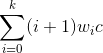
Sum over all elements multiplying distance weighting by distance from start, higher is worse
Where i + 1 is the straight line distance from the beginning of the menu to the end, w_i is the importance weighting given to that item and c is 0.4, for 400ms.
We have a way of describing what would be a cognitive-cost-optimal menu. Now lets find the best menu possible.
Wait, what if our menu has ten items in it. That’s like 10! = 3,628,800 different layouts. We could probably evaluate them all on a modern computer if we were willing to wait long enough, but lets say we want something quick-and-dirty.
Monte-Carlo sampling is often a good starting point. The general theorem behind Monte-Carlo algorithms is based on the law of large numbers — given a large enough sample size with uniform sampling, we’ll probably close enough the answer that we want (with proven optimality bounds for certain problems, but that will come in a later post). We can do a Monte-Carlo search for our answer to get something pretty decent, lets say with 1000 iterations.
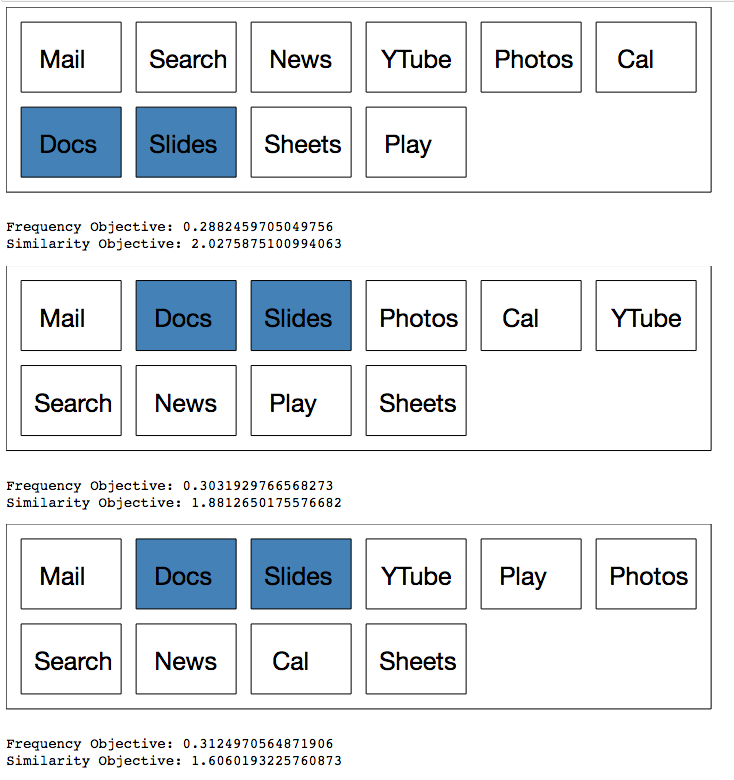
Lets say that we have the following menu items with the given “importances”. The importances are a probability distribution function, so they sum to 1 (roughly, the numbers below are truncated).
- Search: 0.14
- Mail: 0.28
- Slides: 0.1
- Docs: 0.14
- Sheets: 0.03
- News: 0.07
- Calendar: 0.07
- YouTube: 0.14
- Play: 0.01
Okay, lets find an arrangement of those based on Monte-Carlo search:
We’re able to approximately minimize our objective value and we get something like this:
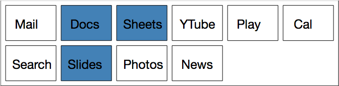
As you can see, stuff that doesn’t get used very often gets put right at the end, whereas stuff used quite often goes at the beginning. Problem solved, right?
Not quite. First of all, notice that this was quite a contrived example — we could have just ranked by importance and been done with it. But also, its a rather unidimensional view of the problem. Someone in that room could have raised their hand and said “I think we should put similar functions together because that’s more aesthetically pleasing”. For instance, Mail and Calendar probably belong together but they are at opposite ends of the spectrum!
Objective 2: Similarity Layout
Now, we have two options. We could ignore them or we could acknowledge their point. Lets formulate another problem where we instead determine how much two items go together and give more weight to putting them side-by-side. If a given pair isn’t mentioned on this list, we don’t really care where it sits in relation to some other item, so we give it a “togetherness score” of zero.
- Mail and Calendar: 0.3
- Docs and Sheets: 0.5
- Docs and Slides: 0.5
- Mail and News: 0.3
- Play and YTube: 0.2
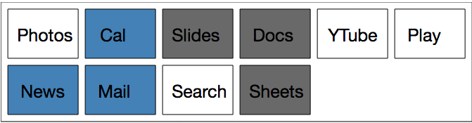
We then define a new metric — this time, for each item in the menu, look over each other item in the menu and work out how close you are to another item and multiply the inverse by the “togetherness value”. This gives a high score if two items that should be close together are actually far apart:
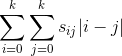
Double sum over all elements, multiplying actual distance by distance weighting, higher is worse
Minimizing this over several random samples puts similar things together as best as possible (eg, Cal, News and Mail all go together, as do Slides, Docs and Sheets), which is nice.
But now our original problem has resurfaced, which is that frequently accessed things might end up at the end of the menu! And worse, we’ve realized that there’s a really crappy tradeoff. Nobody ever uses Cal, but Mail and Cal belong together. So to satisfy the above objective we have to either have Mail and Cal at the beginning of the menu or the end of the menu, neither of which are very appealing. Same thing goes for YTube and Play.
The bikeshed is doomed to continue at this rate and you’re stuck in meeting-hell for all eternity. But maybe if we accept the tradeoff, there’s a way out.
Pareto-Optimal Layouts
Maybe we’re still squabbling and have to meet in the middle. But of course, we’re having a bit of trouble conceptualizing what the “middle” is. One camp can come up with a nice looking similarity layout that turns out to have a terrible score on the frequency layout test. Same thing goes for the frequency layout camp.
Pareto-efficiency to the rescue. We could imagine graphing all of our our possible frequency-layout values and similarity layout values and we want to be able to see for ourselves which layouts sit on the so-called “pareto frontier”, that is, the line that answers the question that if we budge a little bit on one test, what’s the best value that we can get for the other one?
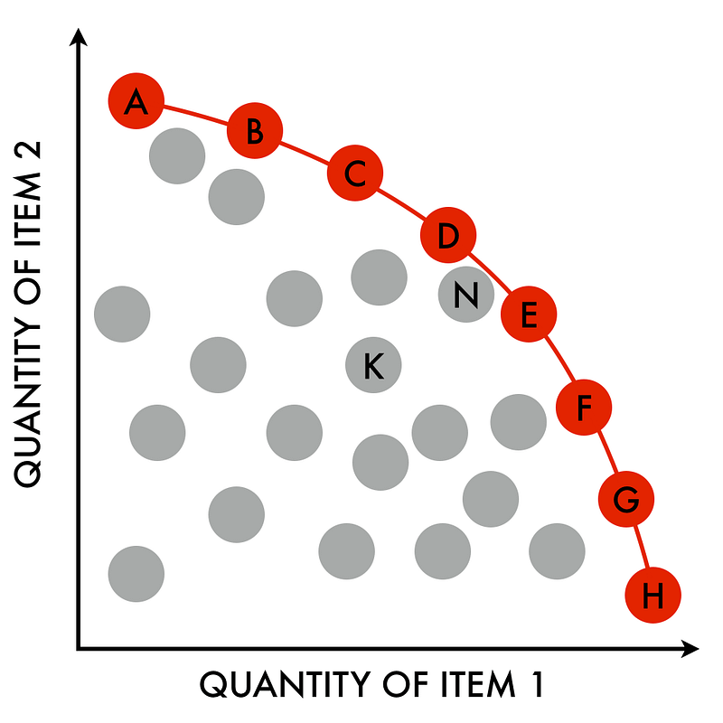
By Njr00 — Own work, CC BY-SA 3.0
In this case we’re looking for the opposite frontier — if we relax the minimization on one score, what’s the lowest value we can get on the other one?
Because we only have two dimensions, it is really easy to calculate this. Just sort on the first value and then take entries traverse through the list of possible combinations, taking an entry if it would give us a better score on the other metric.
If we run that a few thousand times we can visualize the Pareto-frontier for the solution space:
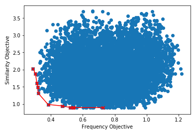
Lets have a look at the layouts on the optimized frequency objective. We can see that these layouts try to put the frequently accessed stuff at the beginning, but they don’t do too much work in terms of keeping items together.
In the middle of the spectrum, we clearly try to keep the relevant things slightly closer to each other, even if it means that we don’t have the best layout in terms of frequency.
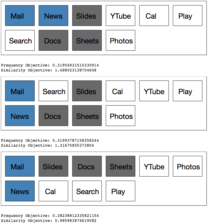
Finally, on the upper end of the scale, we put the similar stuff together in pretty much every case, but the most frequently accessed items are no longer at the top.
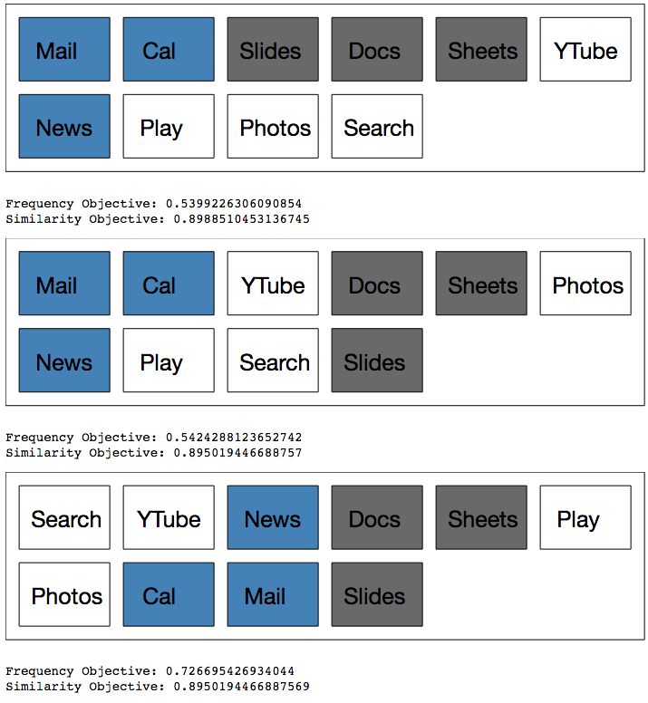
Now we can finally make an informed decision! As usual, it seems like the best decision is somewhere in the middle.
Of course, this is a rather naive way of solving this problem. There has been lots of research that has gone into ways to solve this problem, especially in more than two dimensions. Have a look at this paper for more.
I hope you enjoyed reading this! I’m currently studying a Master in Computer, Communication and Information Sciences at Aalto University in Helsinki, specializing in Algorithms, Data Engineering, Machine Learning, Language and Vision. If you like the way I think, I’m currently looking for internships in Summer 2019, so we should chat!
By Sam Spilsbury on .
Exported from Medium on May 8, 2021.